How many times have you walked into a new or recently renovated teaching space to find that there are multiple screens hanging on the walls? The currently popular configuration is to place two large led screens or perhaps two projection screens on the same wall. The intent seems to be to provide a direct view of the same content to those on either side of the room. Apparently, it has become too great a burden to expect students to turn their heads to a single screen centered on the wall. In more ambitious planning scenarios, the idea is to provide instructors with two surfaces to share different content, but most observers report that such dual content presentations are rare.
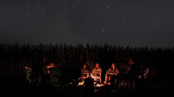
David Thornburg in his book From the Campfire to the Holodeck suggests that “campfire” spaces are optimal for talks and lectures because they pull in participants and help to create a shared social experience. The led or projection screen serves as the modern day equivalent of the campfire, but it can only create a shared experience for the entire group if there is a single point of interest. It is for this same reason that you typically find a single fireplace in a room. Multiple fireplaces or multiple screens should probably be reserved for fireplace or technology showrooms.
Despite the advantages of creating single points of interest for talks and lectures in teaching spaces, there is still often the need for such spaces to transform to support small group work and such group work is increasingly viewed as requiring digital displays to share work both within and between small groups. This is one of the reasons classroom designers give for hanging multiple screens, often on several walls, in new or renovated classrooms. While this design addresses the needs of small work groups, it does not handle the need to move from work group to single large group for whole class activities.
Fortunately, the folks at Steelcase have given serious thought to the challenge, and they have come up with an ingenious design in the form of what they call the LearnLab classroom. The design involves providing digital screens for workgroups and the whole group with some attached to group tables and some wall-mounted. This animation shows the transition from one configuration to another.
The same reconfiguration process is shown with actual students and instructors here:
An earlier version of the same configuration shows what it looks like with less technology:
I like this earlier version because it shows the importance of the room configuration without the emphasis on technology. It shows the use of whiteboards instead of screens in some cases and the tactile nature of working on whiteboards has some advantages.
Whether the Steelcase model is the ultimate solution to balancing the needs of instructors and students and providing an efficient process for transitioning among various learning environment scenarios remains to be seen. Whatever the case, it is nice to see creative thinking about tailoring learning spaces to create good conditions for learning.

Be the first to comment